
iPod Shuffle 1st Gen - Smart Simplicity
- Bailey Tuddenham

- Apr 9, 2023
- 4 min read

“I think there is a profound and enduring beauty in simplicity; in clarity; in efficiency. True simplicity is derived from so much more than just the absence of clutter and ornamentation. It's about bringing order to complexity.”
- Jony Ive
When I design products, I am always aiming to design with simplicity in mind. It's an extremely difficult thing to do; there is a very fine balance between a product that looks like it was designed to be simple, and a product that looks like it's barely been designed at all.
From it's physical hardware and aesthetic to it's user experience, the 1st generation iPod Shuffle is a beautifully simple product, and a perfect example of how designing for simplicity is great design.
Apple took simplicity in technology to a new level, with the 1st gen iPod Shuffle being the first iPod that didn't even have a screen. It was released in 2005 and, while it may have seemed like a step back in terms of functionality compared to previous iPod models, the iPod Shuffle quickly became a fan favourite due to its simplicity and ease of use. While other companies were adding more features to their music players, Apple decided to take a step back and create a device that was simple and easy to use. It's like they were saying, "Hey, you know what's better than a ton of features? Not having to navigate through a ton of features."

Physically, the iPod is the perfect size; I don't know how to explain that, and why that is the case, but it is. It just feels good in your hand. The placement of the buttons lie perfectly in line with the reach from your thumb as you cradle the device in your grip. The buttons themselves are simple, intuitive and few. The whole device is mainly controlled by 5 analogue buttons on the front of the device, along with a slider on the back. The buttons have a satisfying 'click' when they're pressed, which helps you navigate them and use them without even looking at the device. This is particularly useful when using the iPod for things such as exercise, where looking at the device whilst interacting with it would be inconvenient.
Moving the slider down one position puts the device into a standard, playing mode where your music plays in the order that it's been uploaded to the iPod. However, moving the slider to the second (final) position puts the iPod into "shuffle" mode, where your music plays in a random order every time.
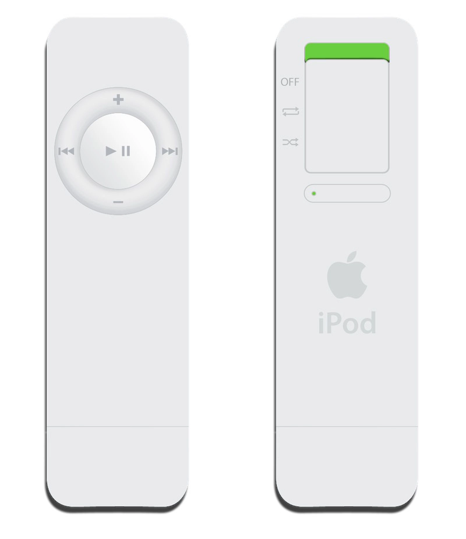


Another unique feature of the iPod Shuffle was the placement of the USB port on the bottom of the device. This not only allows for simple charging (direct into a plug, computer or charging dock), but it also allows really easy music syncing with a computer. You didn't have to get some stupid cable out to plug it in and upload your music; you could literally stick the iPod straight into your computer port and start uploading! This is such a simple idea, and one that, for me, really makes this a fantastic product.


Another feature of the USB section was that Apple made it possible to swap out the bottom USB cap with a neckband accessory. With this neckband, you can wear the device around your neck, making it even more convenient for on-the-go use. This expands the use of the, already brilliant, in-built USB section even further.

After this model of iPod Shuffle, Apple released a further 4 generations. My project Evolution dives deeper into the difference between the models, and how Apple evolved the product based on a range of design decisions, user feedback and mistakes. However, the first generation Shuffle will always be my favourite.


Rating
Hardware Design - 9 / 10
Purely for the design of the USB section, the 1st gen iPod Shuffle has to get a minimum of 9/10 for hardware design. Not only does it make charging and syncing so much easier, it allows a series of accessories to be cleverly combined with the device. It was like Apple's way of saying "Hey, we know you like to mix things up, so we made it possible for you to swap out the bottom cap with a neckband accessory. You're welcome.". The reason that it doesn't get a 10/10 is because of the slider. Although its still intuitive and simple to use, sometimes sliding it to the position that you want can be slightly tedious (maybe this is just because mine is very well used...).
Usability - 9 / 10
The device is really easy to use, and was designed to be that way. It isn't overcomplicated, with unnecessary features and interactions. It was the perfect device for those who didn't need all the fancy features and just wanted to listen to their music. Again, the only reason it drops marks on usability is for the slightly tedious slider.
Fun Factor - 8 / 10
I'm gonna mention it again... The USB section is fun. Maybe not by itself, but as soon as Apple had the idea of accessories that could be used with it - that's what makes it fun. Apple also designed a charging dock for the iPod. It's not required to charge it, and doesn't add anything technologically; its just nice, and that's fun.
Innovation - 8 / 10
The idea of implementing the USB drive directly into the iPod was a great decision. It was a great way of syncing music onto the device, and removed the need for cables. This was a really innovative idea from Apple, along with their accessories that could be attached to the USB section. These are, really, what set it apart from competitors and made it Apple.
Aesthetic - 9 / 10
The overall aesthetic of the device is great; it's simple and intuitive. It's not trying to be any more than it needs to be. It has the classic, early 2000's white Apple exterior, which inspired their MacBook exterior a year later.
TOTAL - 8.6 / 10


